
Saturday, December 29, 2007
Tuesday, December 25, 2007

Monday, December 17, 2007


Saturday, December 15, 2007

Saturday, December 08, 2007
"Match Girl" explorations...


The current project on the Gum or Mints blog is designing characters inspired by The Little Match Girl. I don't know if you're familiar with this tale, but it's pretty grim. It tells of a little girl forced by her abusive father to sell matches on the street during a freezing snow storm. The little girl sees the image of her dead grandmother before succumbing to the elements and joining the only person who truly loved her in the afterlife. No mention of the mother, so I'm assuming she fearfully stood by while the poor little girl was being traumatized.
In my version the little girl ties up her father while he's taking a nap and gives him the ultimate hot-foot.
I'll keep posting new sketches here, and the final art on Gum or Mints.
Thursday, December 06, 2007


Saturday, December 01, 2007
Ken Bald and GEM Studio
Up until 1983 the closest I came to a comic strip was reading one.
That all changed when Ken Bald asked me to color a few Dr. Kildare sunday strips. I was a storyboard artist in advertising at the time, and aside from some package design and a few magazine & newspaper spot illustrations, I didn't have much in print. So this was a big deal to me. I remember being pretty cautious, but the thought of seeing it published in a week or two got me jazzed.
But enough about me, I'd rather tell you about Ken.
Ken Bald has been an illustrator since the early '40s. While studying at Pratt Institute he became art director & lead figure artist at the Binder studio, producing comic book art for Fawcett Publications, the Captain Marvel publishers. Then the war broke out and Ken signed up.
After serving honorably in World War II, Ken resumed his carreer as an illustrator, creating comic books, comic strips, movie posters and ad illustrations, before becoming one of the most in-demand storyboard artists in the advertising industry.
Ken joined Gem Studio as Creative Director in the early '80s, and they created a cottage industry of storyboard & animatic art that would last for two and a half decades. From an original crew of three illustrators and various freelancers, Gem went on to grow in staff and dominate the advertising art market.
Much of this was due to Ken's creative direction and generous instruction to our group of illustrators.
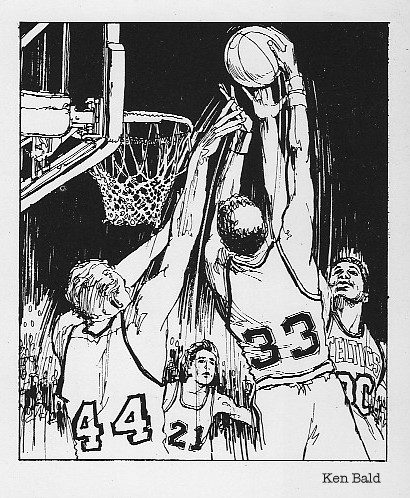
No matter how busy he was, Ken would always take time out to help us with a tough pose or show us how to draw a closer likeness. No one draws film, sports and tv stars like Ken Bald. Nobody.
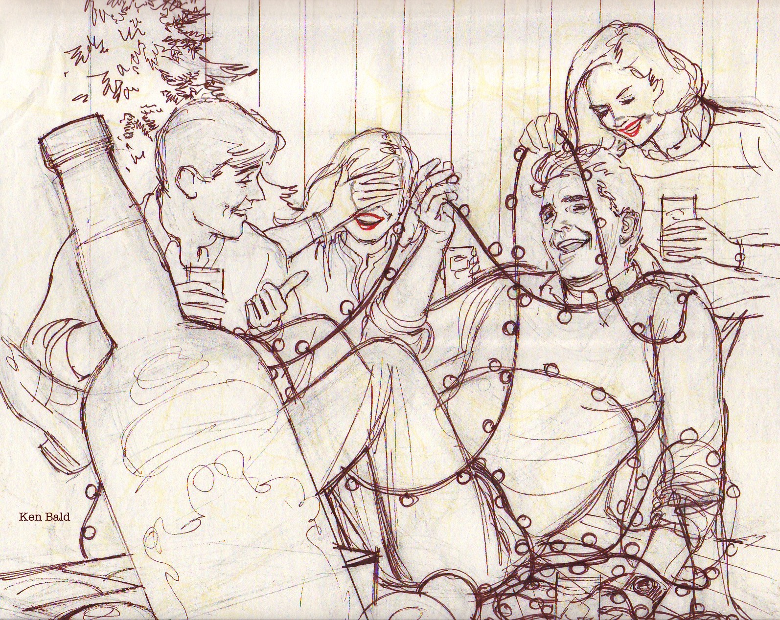
Here's an example... I'll keep adding Ken Bald illustrations for the next couple of days.
----------------------------------------------------------------------------------
12/2/07 update...
This storyboard frame is one of the first pieces Ken made at Gem. It was used in a promotional booklet.
Here's an example of Ken's loose inking style, before the marker rendering.
Billy, Rodney & George.
Ink illustration for another promo piece.
-----------------------------------------------------
12/3/07 update...
Both of these pieces below were created for GEM's "Black Book" ads. Does anyone remember that directory? Back then, if you weren't in the Black Book you were small time. All of the illustrators had to concept and produce their own illustrations for these promotional ads, and if we didn't get it right by the first or second submission it would become a commitee project. Needless to say, we all tried to get it approved on the first try.


-----------------------------------------------------
12/4/07 update...
This Bahamas art was another promotional piece Ken created for our promo brochure, perfect subject matter for his style. The Early Times Bourbon ad in the center is by John Moodie, another master sketch artist and close friend of Mr. Bald. John liked the look of Magic Markers, and used them exclusively. His visuals were always crisp and looked like watercolors. His linework was always done with color Pentel pens.
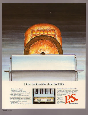
The Proctor Silex toaster below is by Mr. Check Hom, who also worked closely with John creating product art for his storyboards and print ad comps. Every senior illustrator had their own product guys. Check worked with John and I worked with Ken. In addition to our product work we were also responsible for our own workload of storyboards and print ad comps.


That all changed when Ken Bald asked me to color a few Dr. Kildare sunday strips. I was a storyboard artist in advertising at the time, and aside from some package design and a few magazine & newspaper spot illustrations, I didn't have much in print. So this was a big deal to me. I remember being pretty cautious, but the thought of seeing it published in a week or two got me jazzed.

But enough about me, I'd rather tell you about Ken.
Ken Bald has been an illustrator since the early '40s. While studying at Pratt Institute he became art director & lead figure artist at the Binder studio, producing comic book art for Fawcett Publications, the Captain Marvel publishers. Then the war broke out and Ken signed up.
After serving honorably in World War II, Ken resumed his carreer as an illustrator, creating comic books, comic strips, movie posters and ad illustrations, before becoming one of the most in-demand storyboard artists in the advertising industry.
Ken joined Gem Studio as Creative Director in the early '80s, and they created a cottage industry of storyboard & animatic art that would last for two and a half decades. From an original crew of three illustrators and various freelancers, Gem went on to grow in staff and dominate the advertising art market.
Much of this was due to Ken's creative direction and generous instruction to our group of illustrators.
No matter how busy he was, Ken would always take time out to help us with a tough pose or show us how to draw a closer likeness. No one draws film, sports and tv stars like Ken Bald. Nobody.
Here's an example...
 I'll keep adding Ken Bald illustrations for the next couple of days.
----------------------------------------------------------------------------------
12/2/07 update...
This storyboard frame is one of the first pieces Ken made at Gem. It was used in a promotional booklet.

Here's an example of Ken's loose inking style, before the marker rendering.
Billy, Rodney & George.

Ink illustration for another promo piece.

-----------------------------------------------------
12/3/07 update...
Both of these pieces below were created for GEM's "Black Book" ads. Does anyone remember that directory? Back then, if you weren't in the Black Book you were small time. All of the illustrators had to concept and produce their own illustrations for these promotional ads, and if we didn't get it right by the first or second submission it would become a commitee project. Needless to say, we all tried to get it approved on the first try.

-----------------------------------------------------
12/4/07 update...
This Bahamas art was another promotional piece Ken created for our promo brochure, perfect subject matter for his style. The Early Times Bourbon ad in the center is by John Moodie, another master sketch artist and close friend of Mr. Bald. John liked the look of Magic Markers, and used them exclusively. His visuals were always crisp and looked like watercolors. His linework was always done with color Pentel pens.
The Proctor Silex toaster below is by Mr. Check Hom, who also worked closely with John creating product art for his storyboards and print ad comps. Every senior illustrator had their own product guys. Check worked with John and I worked with Ken. In addition to our product work we were also responsible for our own workload of storyboards and print ad comps.


Tuesday, November 27, 2007

Friday, November 23, 2007
El marinero flotante y las gauchas...
 I'm still enjoying the book "LIFE: America's Parade" (2001), especially interesting are the vintage balloons and their abstract designs.
 This visual caught my attention> because it looks like an Oscar Grillo illustration come to life, with its unique composition, color splashes and a certain sailor hovering above the cowgirls.
The photo was taken in 1968.
Thursday, November 22, 2007
Have a Happy Thanksgiving!


 The top two balloons are from 1948 & '47, and they both made an appearance in todays Macy's Parade for the first time in sixty years. I'm hoping that they bring back the clown next.
All photos are
Copyright 2001 Time Inc.
From the book
"LIFE: America's Parade"
Wednesday, November 21, 2007
Honeymooners promo art...
These ads were created for comic book distributors' preview catalogues, usually produced within a day or two. I was responsible for writing the copy, creating the illustrations, hand-lettering and production. They were a lot of fun to work on.


Sunday, November 18, 2007
"The Thing" from another flat file--


 I was five years old when I first saw "The Thing from Another World". Most of the overlapping and science-heavy dialogue couldn't hold my attention, but when the creature made his appearances my eyes widened. Just the thought of all those people being held hostage in a remote ice station by an alien monster made it seem like a terrifying version of the "I'm gonna get you!" game of hide and seek I'd play with my older cousins. The creature scared the hell out of me, but I couldn't look away.
 The most interesting aspect of this film is how little screen time the alien creature was given. And when he is on-screen he's cloaked in shadow. Less was more, much more, as opposed to contemporary horror and sci-fi films wherein all of the gore and details are polished in cgi and thrown at us in each and every scene.
These sketches of the Thing were done while watching a vhs copy and trying to figure out just what this elusive creature actually looked like. In the sixteen years since there have been digitally remastered vhs and dvd releases, along with photos and "making of..." articles in mags like Filmfax, Outre and Cinefantastique, etc... But at the time I made these studies all I had was a vhs player and a pause button.
Looking at these sketches with older, wiser(?) eyes I see plenty of places where I dropped the ball - I didn't notice that he had a chest emblem, five fingers on each hand, his head's too bulbous, etc... but I do remember having fun drawing them.
I hope you've seen this film and appreciate it as much as I do. If you haven't seen it, I envy you- you're in for a real treat.
"Keep watching the skies!--"
Subscribe to:
Comments (Atom)