
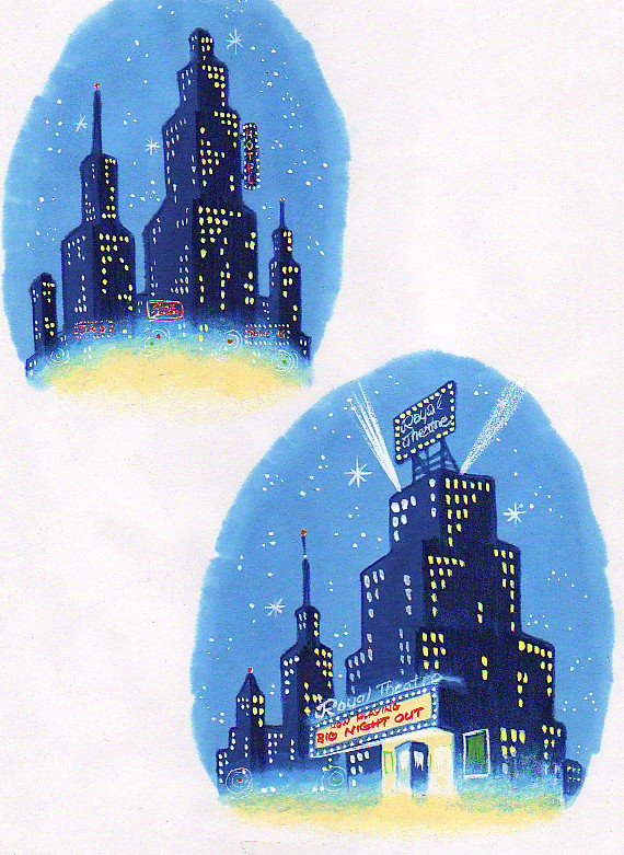
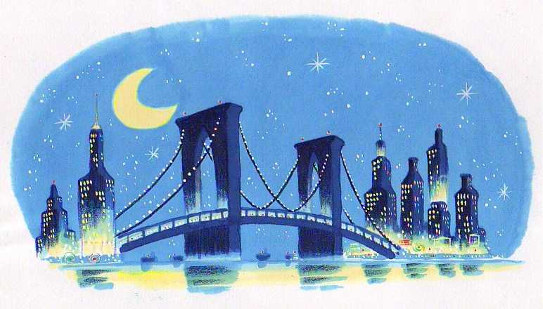
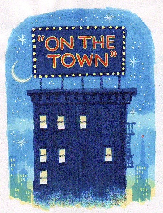
Tuesday, October 31, 2006
Monday, October 30, 2006

Sunday, October 29, 2006


Friday, October 27, 2006

Thursday, October 26, 2006
Tuesday, October 24, 2006
Friday, October 20, 2006
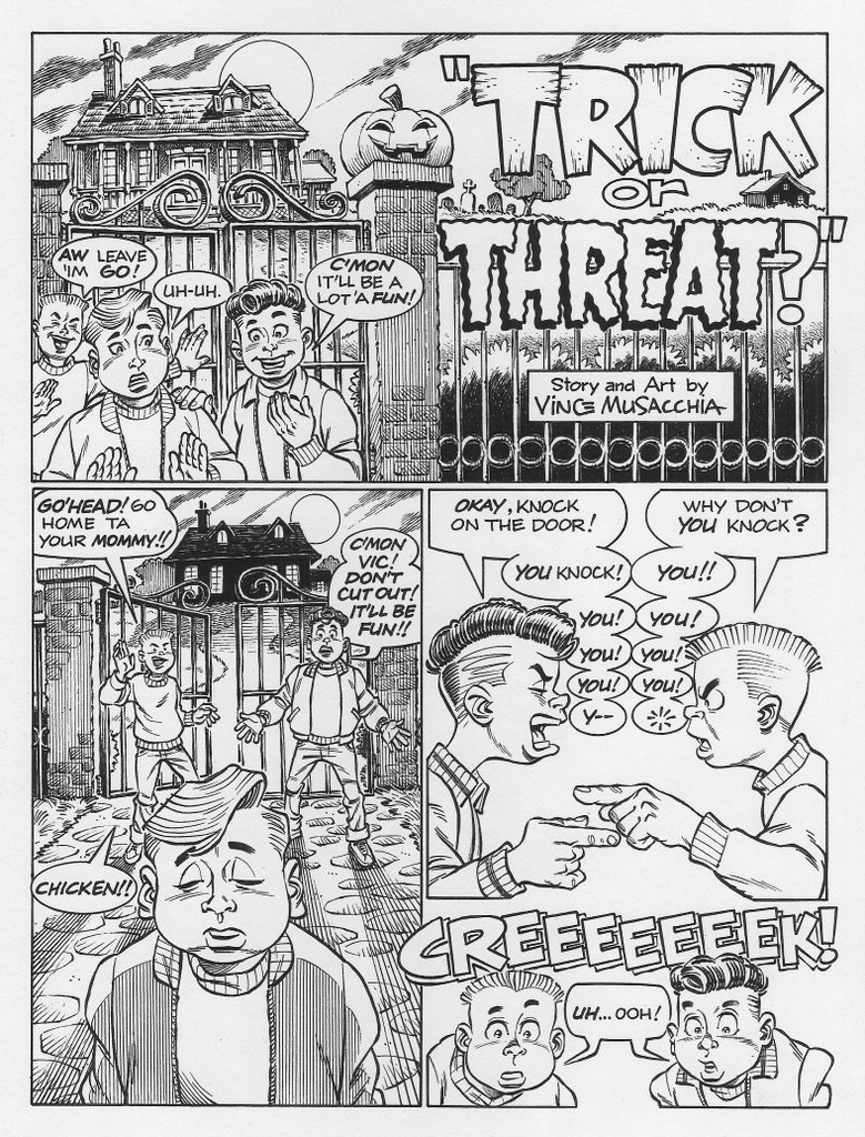
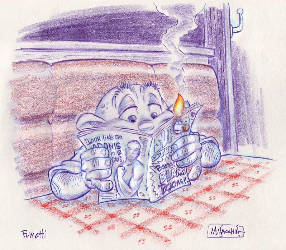
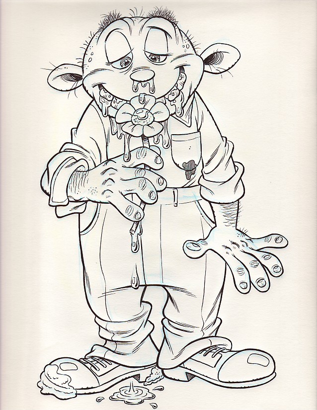
"Bjorn" again...
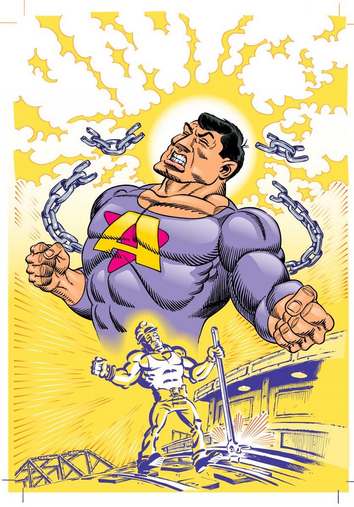
I thought it might be time to post some more artwork created during this century, so here it is. I've been drawing this "little guy" for years, so he'll keep popping up from time to time. He's my little mascot.
I figured he needed a bit of excercise.
Thursday, October 19, 2006
sketchbook 1968
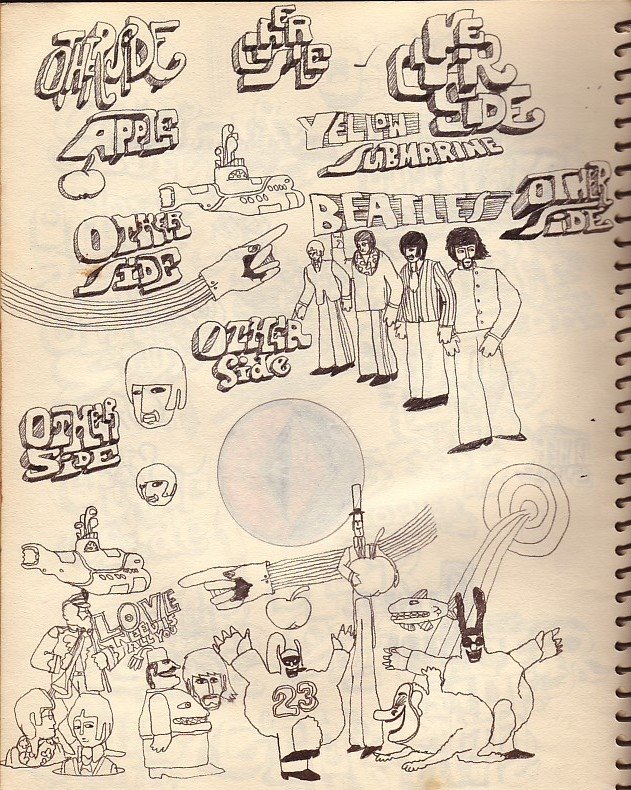
In '68 I never slept. I'd be up all night, obsessively sketching away. One of my obsessions was my band, so I'd constantly be searching for the perfect logo design to paint on my bass drum. Another obsession of mine was a band you may be familiar with.
They had a great logo.
Sunday, October 15, 2006
Joe Simon & Jack Kirby
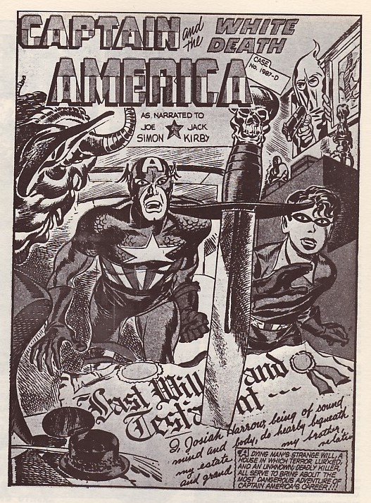

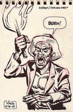


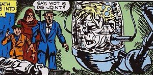
I've been a fan of these two giants ever since I saw a re-print of their early Captain America in '66. Imagine reading their comics and seeing The Beatles on Ed Sullivan at the same time and you'll get a pretty good idea of what it was like back then. "The Modern Marvel Age" of comics was in full swing by then, but these crude-looking stories being published in "Fantasy Masterpieces" looked like nothing I had ever seen before. Heroes fighting for freedom during World War II, instead of Bank Robbers and Evil Scientists or Radiated Evil Bank-Robbing Scientists. No Cosmic Rays or Radiated Spider Bites here, just clear lines of "them against us", written and drawn with an energy and a sense of purpose. The creators were as committed as their comics creations; Joe Simon stayed stateside, assigned to Combat Art Corps at Coast Guard Headquarters in Washington D.C., while Jack Kirby was a Combat Infantryman and saw action in Germany.
Last winter Marvel published "All Winners" Comics Volume 1 in their hardcover Masterworks series. One of the stories was Simon & Kirby's "The Hollow Men", their next-to-last Captain America yarn produced for Marvel. I'd never seen this one before, it was never re-printed. Earlier in the day I bought a new Brush Pen and a tiny sketch book, and began copying S & K panels at the kitchen table; like I did over forty years ago.
It was nice to go home again.
Here are the results...
( I'm including one of S & K's Splash Pages for the uninitiated, and a color scan below of one of the panels that I've "re-mixed", for comparison.)
Saturday, October 14, 2006
For my wife Roz...
She's really missing our family today. Especially our grandchildren: Kayla & Ashley. They live in New York.
Friday, October 13, 2006
Thursday, October 12, 2006
One mo' time...
I know I posted this art before, but this is the final, as published. The image posted back in August was used so that my buddy Rich Tuzon could walk me through the Blogging process. Now it's a few months later and this caveman is learning to use tools.
The original was rendered in Illustrator from my color rough by my friend and frequent collaborator Dwight Wanhala, a terrific cartoonist and Mac Wizard. Then after we felt good about the basic colors we turned on a few effects buttons and- "voila"!
The rays surrounding the figures was a happy accident; Dwight left the gradient setting on. It looked good... so we left it that way.
I like this version much better.
Wednesday, October 11, 2006
Last 30 Sixty Ad...
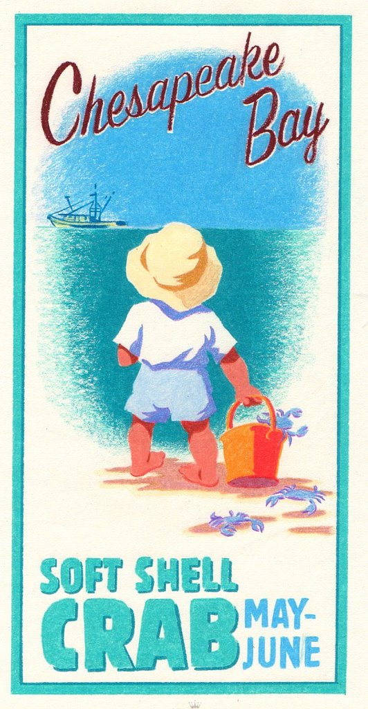
This is the last in the series of Ad Art for King's Fish House/30 Sixty Design. This 'comp" is Prismacolor Pencil on Hallmark Stationery Paper (chosen for its Buff color). I'll post the final art in a few weeks.
'50s Style Ad Art
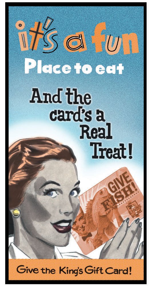
This is another piece that was created with Dave at 30 Sixty Design for the same client as the previous post. Marker Rendering over grey felt-tip inks on Neenah Bond Paper for the figure. I think I did the lettering, probably with a felt-tip pen. The way the bottom copy tilts down slightly on the right is a tip-off that it was hand lettered.
I'm surprised that the "Mac Doctors" didn't catch it. Maybe this isn't a final version, it's hard to keep track.
Tuesday, October 10, 2006
Advertising Art...

I keep writing about working in Advertising, but I haven't posted any of it. So I'll post a few pieces for the next few days. This first visual was art directed by my friend Dave Fuscellaro. I met Dave when he joined the WB Stores after leaving the Dallas based design studio at Nickleodeon. While at WB Dave and I were responsible for (among other things) "refreshing" their Toy line, creating product and packaging art. It was fun work. Especially the packaging. The "Toys" were usually retro-fit mechanics, with Sylvester rocking back and forth singing "Hound Dog" while a cross-eyed Tweety hung from his shoulder.
When Dave left WB he joined 30 Sixty Design as Creative Director. That's when the real fun started! This piece was created for banners that would hang in "King's Fish House", they have a few big restaurants. If I remember correctly one of them is in Long Beach. They also own "Lou & Mickey's" restaurant, located right across the tracks from the Comicon in San Diego.
Working from Dave's concept and direction the art and lettering was created with a Marvy Felt Tip Pen on copy paper, scanned and sent to the studio. Then his expert team of Designers worked their magic and aged the art digitally so it would look like something you would see on a matchbook cover from the '30s.
I always enjoy working with Dave, he's a real collaborator. He doesn't ask for art like you'd order a Hamburger at a Drive-Thru window. And he always comes to the table with a batch of ideas for every project.
He's a real Pro.
Monday, October 09, 2006
There's no escaping destiny...

I guess Gene Wilder was right when he screamed out those words in "Young Frankenstein". I've always loved drawing popular characters. It's probably no coincidence that I work in the business of licensed characters. In the early '70s the Marx Brothers were enjoying a resurging popularity and I couldn't get enough of them. Especially Groucho. I filled up sketchbooks with his image and adapted his humor in my dealings with others. I'm still influenced by him.
I guess classic characters never go out of fashion.
At least I hope not.
Pen & Ink on Bond Paper, circa 1974
(Dig the fancy signature)
Sunday, October 08, 2006
Burning desires...
In the Fall of 1986 I published my first comic book. I'd always wanted to draw comics, but it was a lot easier to break in to the Advertising Industry. Can you imagine that? So, from '78 to '86 I worked on storyboards for TV, and comp art for print ads on accounts like Miller Beer, Kodak, Coca-Cola and others, for clients like J.Walter Thompson, Backer & Spielvogel, etc...
It wasn't as glamorous as it seems. I worked at one of, if not THE Best studios in NYC- GEM Studios, owned by Joe Blangiardo and Mel Schlossberg. The first position I held at the company was "mechanical/ paste-up artist", a very exacting profession- because if you were off by a few picas your ad art and/or copy could wind up in the binding of a magazine, or cropped off altogether. This kind of mistake rarely happened in the industry because studio managers always checked the boards before they were delivered to the client. If it did happen, people died and accounts were lost.
I was one of, if not THE worst "paste-up" artist ever to work at GEM. But I was lucky, the owners liked me enough to make me an Illustrator. I failed upward. At first I would render products, like sweating Lite Beer bottles for print ads and in frames of storyboards, while the figures and backgrounds were rendered by some of the day's best Illustrators. Men like Ken Bald, John Moody and Bob Tremaine, who had all been in the field for decades by the time I met them. This was my art school, my church. These men were generous with their knowledge and time and patient during my learning curve. I was extremely fortunate to be working alongside them.
However... there was still that burning desire to draw comics smoking in my head. One day I visited a Comic Book Shop in Bay Ridge, Brooklyn and struck up a conversation with the owner, Norm Abramoff. At the time "Mutant Ninja Turtles" were causing mighty ripples in the industry, especially because it was self-published and selling nearly 100,000 copies (maybe more, maybe less) per issue.
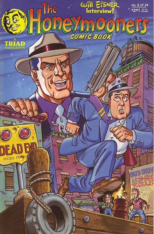
I don't remember how it happened, but Norm said he wanted to write and edit his own comics. I mentioned that I'd always wanted to draw comics, and that my portfolio was in my car outside. Somehow we came to the conclusion that it would be great to create a comic book based on the "Honeymooners" TV series. We might have been looking at a pile of Dell Comics, they made comics based on almost every TV show on the air in the '50s and '60s. In fact, if they were still in business today they'd probably be doing a comic book based on Neal Adams' "Flonase" Bee commercials.
So we hired a lawyer, and approached CBS/Viacom about it, and they were open to the idea. I drew a batch of samples and model sheets, and they were submitted to, and approved by Mr. Jackie Gleason in two days. Imagine that? Next stop was finding a small publisher who was already up and running. We found one, he pulled some shady stuff - so we pulled our book away from him and found another publisher.
We published 12 issues under Roy Burman & Ron Merians' TRIAD imprint, only stopping when Ron passed away from a stroke and complications. With our business leader gone, we had no other choice but to fold up the tents.
So I went back to advertising. But not for long. I joined the WB Stores in '95 and worked there until they closed. I've been with Disney Consumer Products for the past three years. Great place, with plenty of creative people and exciting projects to work on.
But I did get to do Comic Books.
Friday, October 06, 2006
Pulp from the past...

In 1974 Warren Publishing brought back Will Eisner's SPIRIT comic strips in a black & white- quarterly magazine, and I thought that my head was going to explode! I'd seen the Spirit before in 1966 when Harvey comics put out two 68 page Issues. In the early '70s underground publisher Kitchen Sink published an issue, but then it was gone.
I'm a bigger fan of the black and white Spirits than the color version. The Spirit in B&W looks like a mix of WB Bogart movies and Max Fleischer Popeye cartoons, and they read like a Billy Wilder or a Howard Hawks film. It also helped that they would publish some of the continuing stories in order, as well as themed issues like the Christmas Special.
I was "hooked"! I ran out and bought some Illustration Board, brushes and Higgin's black Magic Ink. Instead of just copying Eisner's characters I created my own; gangsters like "No Nose" Nolan and "Combs" Brunetti. The guy peeking into the window was Detective Dent Bender. I did about four or five of these until I was distracted by the next big thing.
This Illustration is from January 6, 1974.
Okay, here's another "Pulp"...
This one was based on the "Men's Adventure", or "sweat" magazines that were published in the '50s. There's also a color version of this, but I don't want to get Rich too wound-up.
He so crazy!
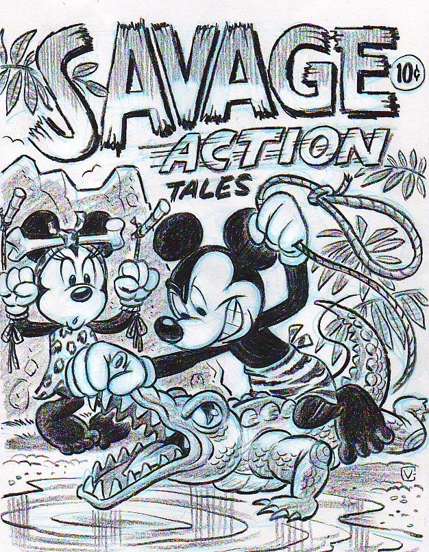
Cats and Mice... 'Pulp Style"

I've had the pleasure of working with Jeff Shelly on the Mickey Team for the last 2 years. Jeff is the teams' Director of Character Art, and as creative leader he's responsible for concepts and finished art. With finished art Jeff would give me very clear rough pencils, and I would do the clean-ups. Jeff would review my finals and if there were any revisions needed he would bounce them back to me with overlays, and I would revise the art.
Concept art is another story. In this case Jeff came up with the idea of putting Mickey & Co. in situations based on cover art from Pulp Magazines of the '30s. After looking at some reference together, I set out to pencil a few concepts for presentation to the rest of the team. At this stage there isn't as much worry about being "on model" or expert draughtsmanship. Loose pencils and indications are enough to get the point across. That's why Mickey's legs look a little "wonky", I was running out of room and the lettering at the bottom was already done.
When it comes to drawing Mickey Jeff Shelly is one of the best. You can be sure that if this concept is approved he'll be doing the final art.
In a future post I'll show you a project we worked on for our Electronics Divisions' package art, from rough to final.
Tuesday, October 03, 2006
P.S. ...
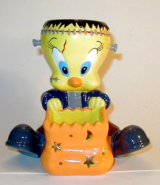
Unlike the "Bugs Mummy" concept, this one with Tweety as Frankenstein was actually used on product. Here's an image of the Votive candle that the WB Stores produced in '98.
Trick or Tweet...

Okay Rich. I guess I'm blogging for you... well good enough. I guess Stefane's busy and Matt's moody and Gerby's out hoisting a few in a London Pub, but you're here and that's fine with me. This visual is the second in the series of unused and overlooked art from the old WB Stores. Marker again, and a scan of a color copy. But, maybe you and a few others will enjoy it.
I'm trying for a Halloween Theme this month, so let's see how well it goes.
God knows commercial art can be scary.
Monday, October 02, 2006
Here a Mummy, there a Mummy...

I used to be a Sr. Illustrator at Warner Bros. Studio Stores, probably would still be there if they didn't close them down. I'm at Disney Consumer Products now, and I've never been happier. I spent a few minutes this morning putting Winnie the Pooh into a Mummy costume, as part of our Fall '07 design program; and it reminded me of this piece.
I apologize for the crappy reproduction. It's a scan of a lousy color copy of a marker rendering. If I find the original art I'll post it, but this will have to do for now. This art was created for a Halloween T-Shirt collection, but WB pulled the plug on them.
They did that a lot.
Sunday, October 01, 2006
Happy October!
I finally have a plan.
This blog has been whispering in my ears every day, but I think I've got it figured out for at least the rest of the month.
Subscribe to:
Posts (Atom)