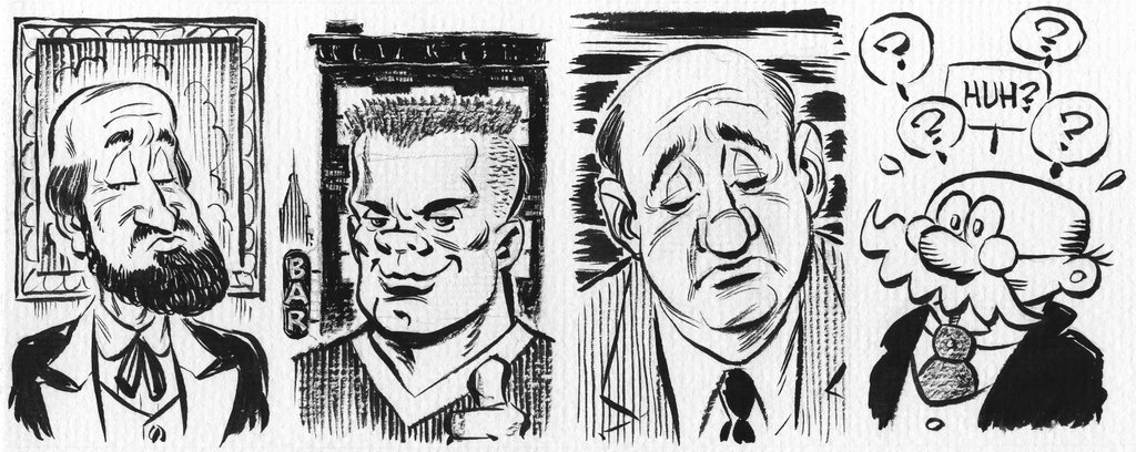
Wow! There is no clearer example of versatility than this latest post, Vince. Question: That textured effect, is that a heavy brush or does the paper have some tooth...or both?
OK, one more thing...I love the way you framed the characters, esp the first panel. The "Bar" sign in BG for generic frat boy; the horizontals behind the vertical pins of the suit...awesome!
Eric, here's your answer: Fridays post was art originally created for a watercolor study. That's how I wound up inking on wet-strength watercolor paper. I still haven't started the watercolor yet I liked the feel of the paper so much I decided to fill the rest of the sheet with quick inkings over loose pencils.
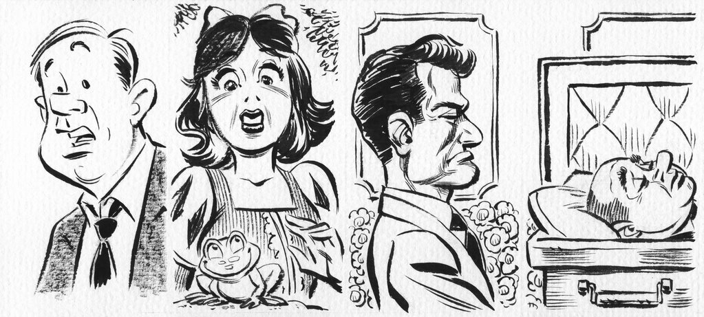
The brush is a #2 Winsor & Newton Sable. Great brush, very responsive. This type of inking is usually done on 2 ply strathmore, but I think I'm going to switch to watercolor paper from now on. The best thing is the way it takes drybrushing. And in case I later want to add color to an inking I'll be on a more suitable surface. Ever try to color on Strathmore? Not fun.
Nice inks Vin! You seem to have a lot of control with that brush. I like all the different lines and textures you've created. Keep up the good work! Ry
A great gallery Vince. You ink is really alive and the choice of paper gives it a fabulous grain that makes it even more alive enhancing the balance between wet and dry. I love it.

10 comments:
Wow! There is no clearer example of versatility than this latest post, Vince. Question: That textured effect, is that a heavy brush or does the paper have some tooth...or both?
OK, one more thing...I love the way you framed the characters, esp the first panel. The "Bar" sign in BG for generic frat boy; the horizontals behind the vertical pins of the suit...awesome!
gorgeous inks. wow!
kimzam
Thanks for the kind words Eric & Kim.
Eric, here's your answer:
Fridays post was art originally created for a watercolor study. That's how I wound up inking on wet-strength watercolor paper. I still haven't started the watercolor yet I liked the feel of the paper so much I decided to fill the rest of the sheet with quick inkings over loose pencils.
The brush is a #2 Winsor & Newton Sable. Great brush, very responsive. This type of inking is usually done on 2 ply strathmore, but I think I'm going to switch to watercolor paper from now on. The best thing is the way it takes drybrushing. And in case I later want to add color to an inking I'll be on a more suitable surface. Ever try to color on Strathmore? Not fun.
Nice inks Vin!
You seem to have a lot of control with that brush. I like all the different lines and textures you've created.
Keep up the good work!
Ry
A great gallery Vince.
You ink is really alive and the choice of paper gives it a fabulous grain that makes it even more alive enhancing the balance between wet and dry.
I love it.
Thanks Ryan & Max.
I had fun with these inks, glad you like them.
these are so good, V. I don't even know where to begin. Let's just start with, I LOVE THEM!
I concur!
Thanks Rich & Nic.
Post a Comment